4.2.14


WHITE

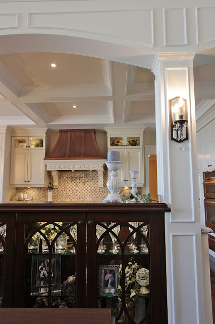
It’s all around us these days.  We have endured another week of winter and its snowfalls, and you’ve probably had enough of it, but it looks like we will be seeing a lot more of it throughout the year. I’m not referring to the snow – but rather the colour and texture of “white”. Have you noticed that when an object is white, the subject matter itself becomes more prominent – our tactile signals intensify.  One is aware of its shape, form, texture and pattern.  It makes you want to touch it, not just look at it.


Every day there are new ideas and concepts to create better, more livable spaces and white is everywhere;  not only in modern spaces, but through retro to contemporary,  transitional and traditional décor.  The beauty of white is that it transcends across the design world into everything with elegance and impact.At the IDS (Interior Design Show) in Toronto a couple of weeks ago, we saw much evidence of this.  There were a number of items, such as this wall mount kitchen faucet from  .  There were many stainless steel and chrome fixtures, but this one stood out from the others…


Miele

How about this Miele double oven combo.  Gasp!  It’s white!  You just ditched your white appliances a year ago for the new stainless steel models.  Fridges, ranges, hood vents – all newly available in white.  Just as the style magazines are calling grey the new neutral, and blue the new black, now white is the new stainless!


GRAFF


In addition to the ever popular white kitchens on display, were the white glass front appliances, wall coverings, wall sconces, chandeliers, onyx sinks, artwork, kitchen sinks, accessories, small appliances, cabinetry, hardware, tiles, solid surfaces and counter tops.  It’s easy to take the colour white for granted because it has always been there, so IDS 2014 showed us where it is and where it is going.


White. It’s not a colour, but it is a colour.  It can be warm. It is fresh.  It can create a footprint, and in art it can represent negative space.  White is every colour of the spectrum.  We see it throughout history and in our daily lives, in the natural world, in art, fashion and in interior design.  It is the colour which can be seen in any light….


25.7.13

Collage It Right

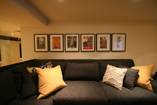
Who doesn't love an art collage, right? They have been around for centuries, grouped together in every which way, without worrying about matching it's subject matter to the room decor. We still feel strongly about this notion. Art does not need to match the room, but rather the owner's personality. Buying art should be exciting and a collective effort over all. Art should speak to you versus choosing it because of the colours.

via

Now a days, you can buy all sorts of wall templates to help aid you in the "perfect" collage. Is this necessary to follow one of the handy templates? Sure, if you need a guideline, but have more confidence than that. Start by arranging the photos on the floor first, and see how you like the arrangement to flow. If you have ever seen us do this, you will realize it takes time to figure out the best arrangement. After you have found your favorite configuration, start with the centre picture and work your way out. Personally, we feel eyeballing it works well if you are going for a more casual, scattered look. If you prefer a more linear look, definitely take out that measuring tape.

An Interior Works collage

via

via
via


11.7.13

An Inspired Room: Industrial Greys

It's no surprise that grey has had the sustaining power of beige and taupe. It's not going anywhere, anytime soon. It has a classic element with an edgy appeal. Warm greys tend to be more for the traditionalist, while cool greys are more for the modern sort. In our "An Inspired Room", we have paired warmer greys with warm wood tones and industrial clad accessories. To keep it simple, we went to one store, Crate and Barrel to find what we were looking for to create this look.


25.6.13

Tired Lakeside Home Gets A Major Renovation

One of our long time clients decided to purchase their dream home, along side Lake Ontario, with views stretching to the Toronto shore line. Although the views were stunning, the interior lacked the same flare. It was tired, dated and in need of some major TLC. With the help of Paul Fittler, his crew and our team at Interior Works, we turned this drab lakeside home into a place that truly feels like a vacation home.


6.6.13

How To Spruce Up Your Outdoor Living Space

As soon as the warm weather hits, everyone is anxious to spend time outdoors in the fresh air and sunshine. Homeowners are maximizing their time spent outside by creating fabulous, outdoor living spaces. This trend began in 2010 and continues to gain popularity as people invest in their backyards. These spaces can range from covered porches, to outdoor patio sets, to kitchens and even outdoor televisions! If you don't want to break the bank, try a few of these tips to create your own backyard oasis.

1) Brighten up your deck with an outdoor rug and a few toss cushions


2) Recycle some old furniture from inside or from a second hand store. 
Paint it your favourite colour of summer and voila!


3) Add a few planted pots to bring the outdoors right into your space!


4) A couple lanterns will really set the mood on a summer night.


5) If you have a dark, covered porch or small space... 
reflect some of that light with a large mirror.


23.5.13

Go BOLD! 2013 Colour Trends

Bold colours aren't just hitting the runways this spring, they are being splashed on walls, draped across windows and tossed on couches and chairs. We are loving these bright colours and patterns after the long, grey winter. If you want to liven up your home with a few accents, try Pantone's Colour of the year,Emerald. A few toss cushions can really brighten a room.

Emerald 

Emerald green isn't your colour? Try another one of these 2013 favourites...

 Lemon Zest and Monaco Blue
(source)

 Nectarine
(source)

Poppy Red

13.5.13

The CAMBRIA Difference: Why quartz?

Remodeling your kitchen or bathroom and looking for a stone counter surface? Consider choosing Cambria quartz! Quartz is a natural mineral that is ground down and mixed together with resins to form a hard surface. Cambria is known for the quality of their product, which is made up of 93% pure quartz, opposed to granite which is generally 40 to 60%. The high concentration of quartz creates a product that is non-porous and maintenance free, so you don't need to worry about those red wine spills. Quartz is even durable against surface scratches and damage and does not require any sealant. Better yet, Cambria carries over 100 different designs that share the same price! This family owned company, is also committed to sustainable practices in their manufacturing process. 

Would you like to know more about quartz? Check out Cambria, our favourite quartz company's website or come in and take a look at some of our samples.

Take a look at how we used Cambria's "White Hall" in one of our projects...


Here are a couple more of our favourites:

                                                                     HALSTEAD


                                                  CAMBRIAN BLACK

                                                 BELLINGHAM
 
   (source)